
Why Your “Safe” 10% Test Isn’t Actually Safe
How inclusion and test split setups influence learning and impact


👋 Welcome back! In this newsletter I’ll be tackling a debate I hear teams having far too often: whether an experiment should run at 10% or 50%.
It usually sounds like a discussion about risk.
In reality, it’s a muddled conversation hiding two very different decisions, neither of which is being made explicitly.
Before we get into details, here’s the mental model I use to cut through the noise:
The core idea (read this even if you skim the rest)
Every experiment design choice involves two inputs:
How much of the total population is included in the experiment (0–100%)
How the included users are split between control and test (100% control to 100% test)
Inside that space, different outcomes emerge:
Faster or slower learning
More or less business impact while learning
Most teams collapse all of this into a single “10% vs 50%” debate.
That’s the mistake.
ℹ️ To make this material as accessible as possible, I’m assuming a typical A/B experiment setup where the two conditions are control and test. The same key takeaways apply as you expand to multiple variants.

Decision 1: Learning efficiency (power & speed)
This visual below represents how well and quickly you can learn from various combinations of these two factors: population included (x-axis) and split between control and test (y-axis).
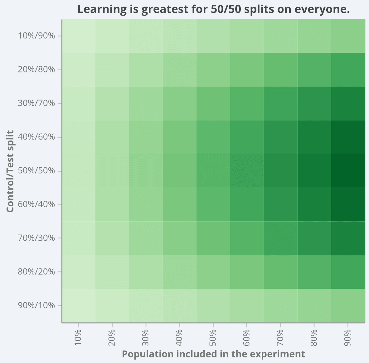
This visual captures something many teams feel but struggle to articulate:
Learning accelerates as more users are included (moving left to right)
Learning is maximised near balanced allocation (moving top/bottom to centre)
Unequal splits slow learning in both directions
Did you join my recent “Intro to A/B Test Statistics” webinar?
If not but you want a better understanding of how things like sample size influence learning power, you’re going to want to catch it!
Register for instant access to the recording: https://luma.com/0slq13al
Decision 2: Business impact while learning
Now for the dimension most experiment discussions completely ignore.
This visual below represents how much impact an experiment can have on customers and your business depending on these two factors: population included (x-axis) and split between control and test (y-axis).
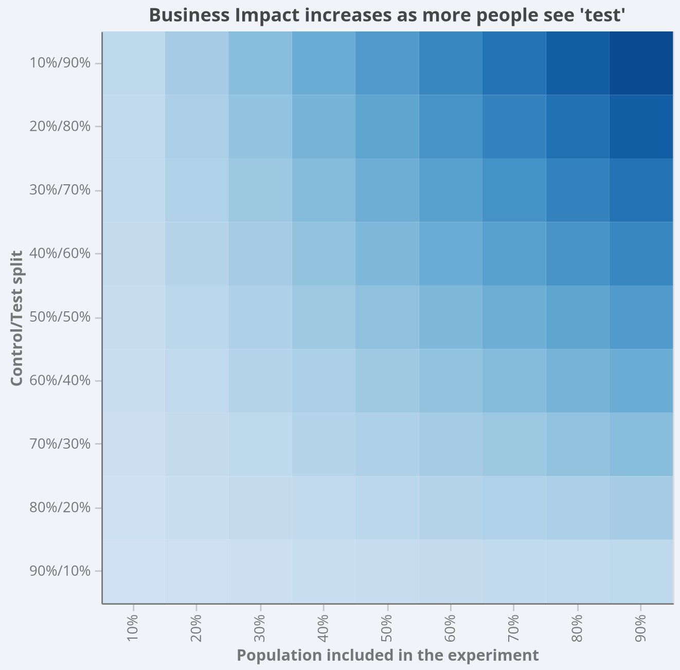
This visual makes something uncomfortable — but important — very clear:
Experiments create real business impact while they’re running
That impact scales with exposure
Low exposure caps both upside and downside
Higher exposure accelerates both value creation and risk
It’s All a Tradeoff
At this point, the 10% vs 50% debate should look a little different.
You’re not choosing between “safe” and “risky.”
You’re choosing where to sit on a surface that trades off:
Learning speed & statistical robustness
Against realised business impact or downside exposure
There isn’t a single correct percentage.
But there are clearly better and worse places to sit depending on what you’re optimising for.
Let’s make that concrete.
Three Common Choices (Side by Side)
Imagine these three common choices teams might make: A, B, and C.
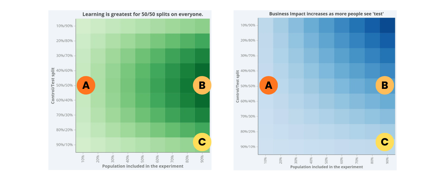
🟢 Choice A: Low inclusion, 50/50 split
This often feels responsible.
Balanced allocation → decent learning per included user
Limited exposure → capped downside
Low business impact during the test
But here’s the tradeoff:
Slower learning overall
Longer time-to-decision
Delayed value realisation (or even extended downside)
This is fine for catching catastrophic issues early.
It’s not great if you care about speed.
🟢 Choice B: High inclusion, 50/50 split
This is what the math — and real-world experience — tends to favour.
Fastest learning (and fastest to find and kill harm)
Strongest statistical robustness
Clear, defensible decisions
Meaningful business impact while the experiment runs
The tradeoff?
You’re exposed while uncertain
You need good monitoring and rollback discipline
But in stable environments, this is usually the most sensible default.
There’s a reason 50/50 at high inclusion sits on the “ridge” of the learning surface.
🟢 Choice C: High inclusion, 90/10 split
This one is popular.
It feels cautious:
“Let’s give most users the safe version.”
“We’ll still learn something.”
But the surface tells a different story.
Learning slows compared to 50/50
Variance increases
Trust in results drops
You gain little real protection relative to what you sacrifice
In theory, unequal splits can offer minor statistical benefits.
In practice, theory and production systems rarely align. Or, simply put by Kohavi, Deng, and Vermeer (2022), as:
“Beware of Unequal Variants“
Unless you have a compelling reason, this is often the worst of both worlds.
How This Plays Out in Ramp and Rollout
The surface becomes even more useful when you think in terms of movement and not just static points.
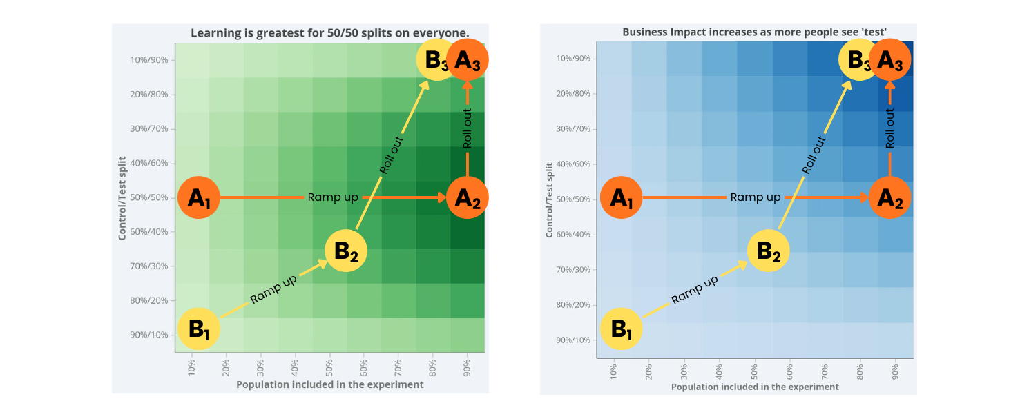
Let’s compare these two patterns.
✅ Path A: The High-Performance Path
Low inclusion, 50/50
Catch egregious issues quickly.Rapid move to high inclusion, 50/50
Maximise learning speed and decision clarity.Move vertically to 100% treatment
Commit once confident.
Visually, that’s:
Left-middle → Right-middle → Top-right
This path:
Minimises time spent uncertain
Preserves statistical robustness
Accelerates realised business impact
❌ Path B: The Common but Suboptimal Path
Low inclusion, 10/90
Slow creep upward and right
Eventual rollout
This path often:
Prolongs uncertainty
Encourages peeking and reinterpretation
Delays value capture
Reduces trust in early results
It feels safer.
But it’s often slower and less clear.
The Real Punchline
There’s a reason high-inclusion, 50/50 sits at the sweet spot of the learning surface.
It maximises:
Speed
Trust
Decision clarity
You can deviate from it.
But if you do, be explicit about what you’re trading away.
Default to clarity.
Shift away in a considered fashion.
And remember:
If your exposure decision takes 30 minutes to debate, it probably wasn’t a statistical decision to begin with.
Try it for yourself
If you’d like to explore how these tradeoffs play out in your own context, I built a free power calculator where you can:
See how sample size affects time-to-decision
Explore minimum detectable effects across traffic levels
Understand how allocation choices influence statistical clarity
Play with different setups and see how the numbers respond
👉 You can try it here:
It’s a simple way to turn intuition into evidence, and to make exposure decisions based on tradeoffs, not instinct.
Until next time 🙌
Simon
linkedin.com/in/drsimonj
Some of my other resources you might find useful:
🧮 The Experimenter’s Calculator: a tool to plan high-quality experiments
📊 Intro to A/B Test Statistics: a free webinar for practitioners